“Nine fruit workshops” is the third social enterprise founded by Libertas Foundation, trying to connect with high-quality suppliers to provide a wide variety of products for customers and assist the disadvantaged groups in counseling to develop sales skills and interpersonal skills through the process of introducing products, ordering, packing and shipping, in order to help them to rebuild their self-confidence and return to society successfully.
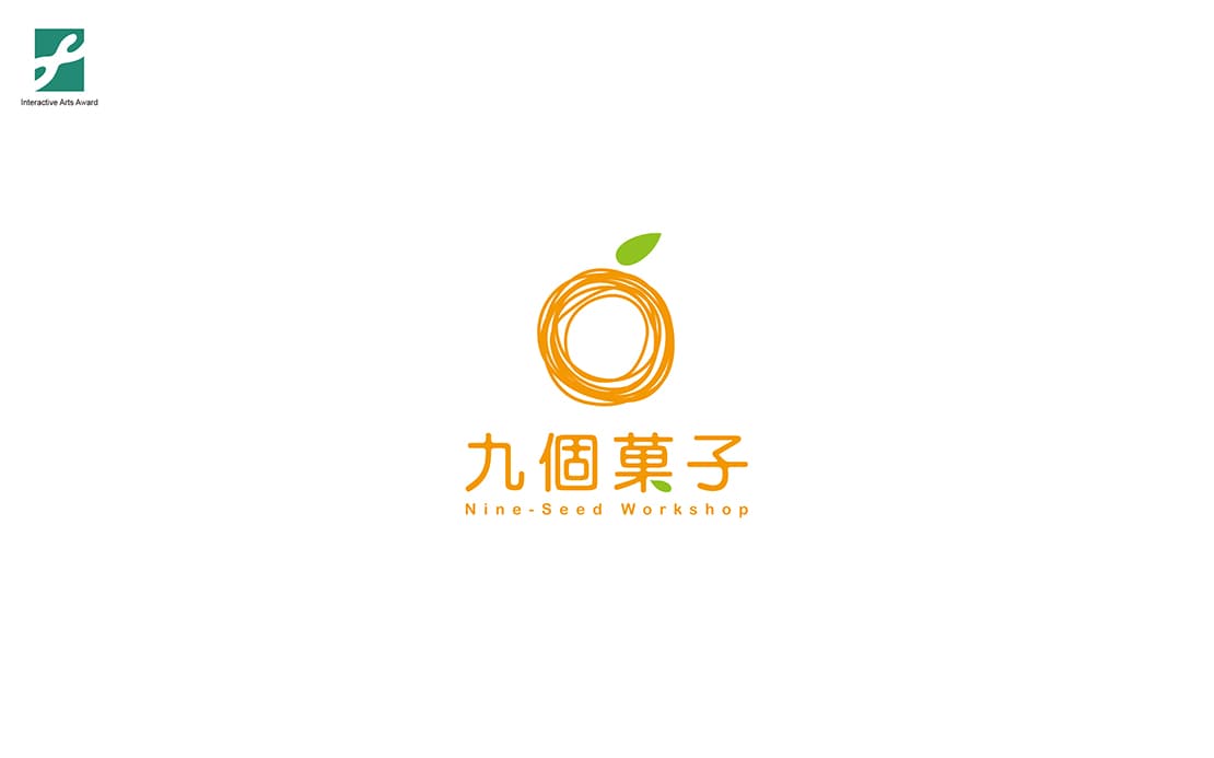
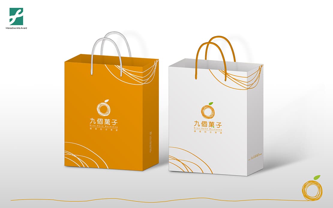
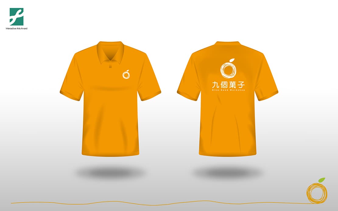
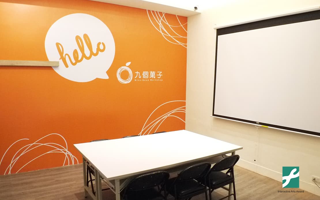
With nine hand-drawn lines and concentric circles, we formed a denser circular frame with a neat green blade. Visually, the hand-drawn circles demonstrate a lively and comfortable image. The green leaves of geometric lines show a visual contrast and an interesting effect.
In the connotation part, the nine unfinished concentric circles symbolize that every life is not perfect. However, by turning the circles with a common goal, we can accumulate more energy and accomplish many things that were impossible. The above green leaves symbolize the beginning of a new life. The green leaves absorbing the sunshine, air and water needed in life to create endless possibilities for the continuation of life.
The overall tone of warm orange is the main focus, hoping to bring people the feeling of warmth. We start from the heart, insist on providing high-quality products, as well as show the strength and warmth of the brand.