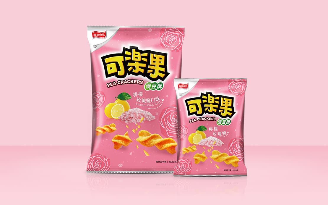
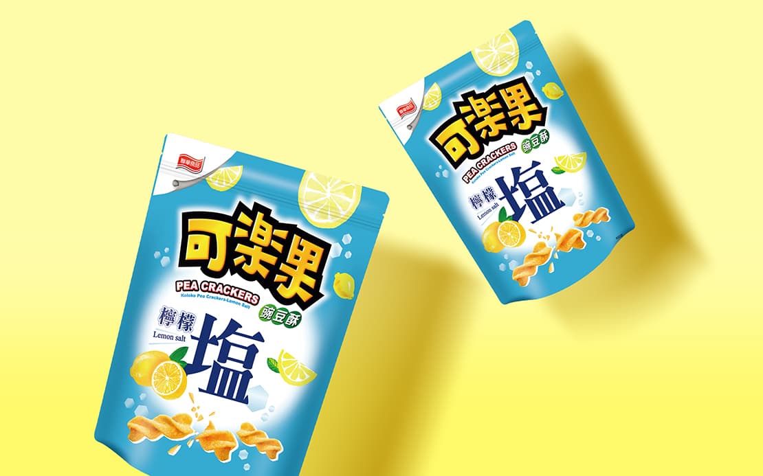
Established in 1951 at Dihua Street, Lian Hwa Foods Corporation existed in Taiwan for more than 60 years. With persistent, hard working and dedication spirit, the Company found a niche in Taiwan's food industry. The Company keeps following the spirit of innovation and change to launch the Lemon & Rose Salt flavor this time. Combining the Western romantic seasoning with pea crackers, it turned into a unique mixed flavor of Western and Eastern culture. It will definitely give you a brand-new taste experience.
The illustration style is used as the main design of package. Rose color and stripes scattered in every corner of package. Well-elaborated flavor shows perfectly the fresh Japanese style, which attracts young female customers. The package with colorful, cute and energetic personality makes buyers feel happy and delighted when consuming the product.
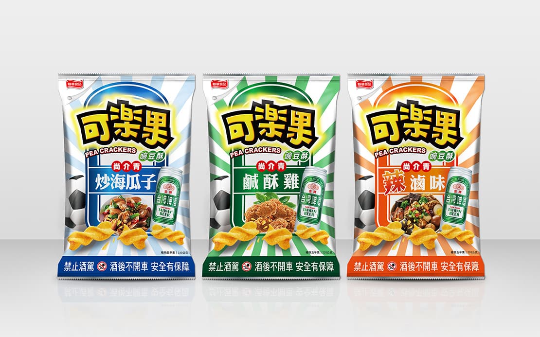
Genuine Taiwanese flavor! Lian Hwa Foods Corporation and Taiwan Tobacco & Liquor Corporation are iconic companies for Taiwanese foods (the former) and the alcohol (the latter). In 2018, two companies cooperated in launching the pea crackers' limited edition to welcome the arrival of FIFA World Cup; the best side dish flavors for beer are launched at once: fried salty chicken, stir-fried clams with basil and spicy braised snacks. These are the best flavors ever in the history of snacks, ones that you cannot miss when drinking beer.
The design of Taiwan Beer Gold Medal that Taiwanese people are familiar with is used on the package in order to make people have intense cordial feelings and perceive the unique Taiwanese style. The package with a radial design background gives a visual impact of delicious pea crackers and definitely let clients to associate crackers with Taiwan beer when they enjoy their spare time. Moreover, the concept of soccer will, without any doubt, make pea crackers attract consumers' attention during FIFA World Cup.
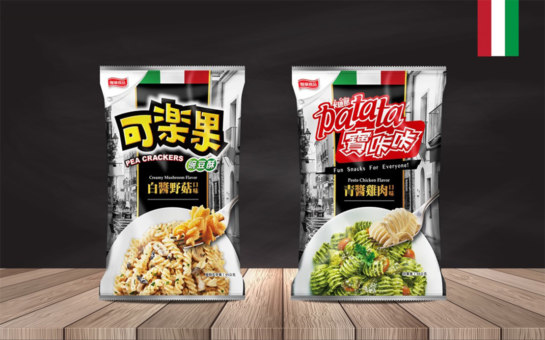
How do you taste a luxury food with an affordable snack? Lian Hwa Foods Corporation launched Italian Style Pea Crackers Series with the flavor that consumers could feel like dining in an expensive restaurant with fascinating taste in their mouth by just taking a bite of these snacks. Easy going at the leisure time, what a joy!
Our packaging design aims to enhance the connection between the snacks and delicious cuisine. Through the image of Italy and a cherished memory of the streets, using gold color as highlights, once again shows a romantic Italian style. From a coveted plate, the famous snacks of Taiwan are served as if they were from the cuisine of an Italian domestic restaurant.
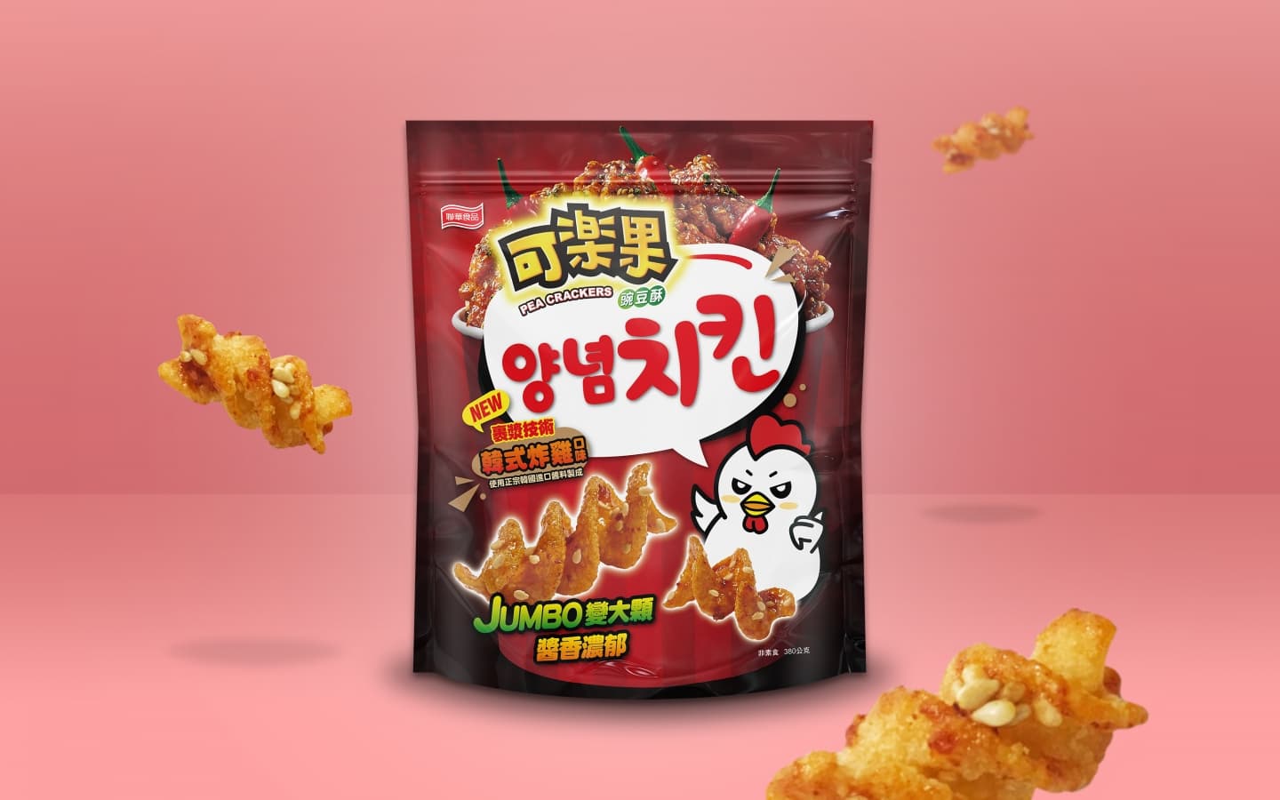
Using Korean style for the packaging design, the spicy red at the bottom with shimming light, not only sets off the delicious Korean fried chicken, but also brings out its visual level. When consumers see this package, their mind will have the instant association with this enticing food. And lovely little chicken illustrations is adding more entertaining to the package. So that no matter adults or children, they will all want to taste it immediately when they see the package.