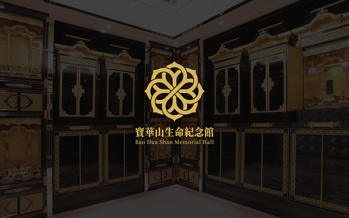
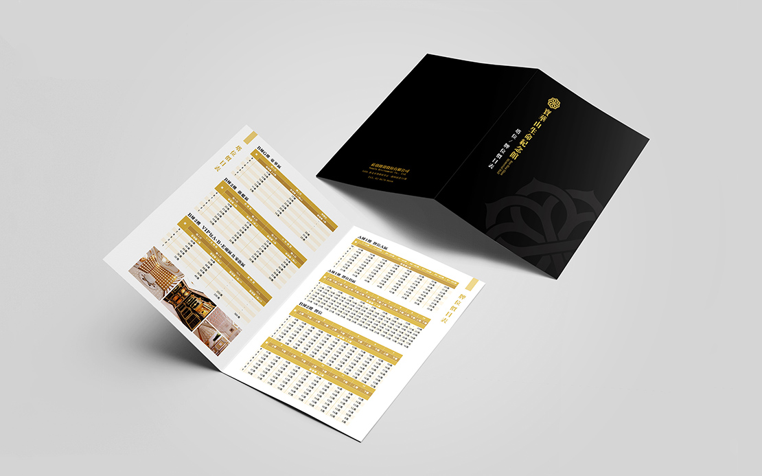
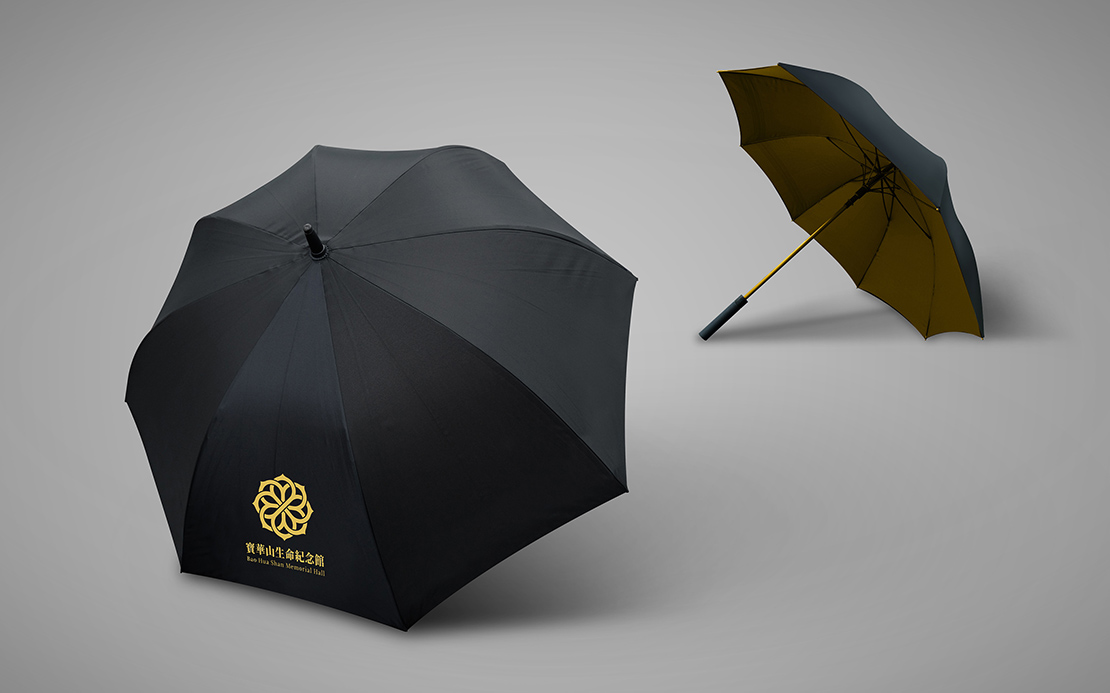
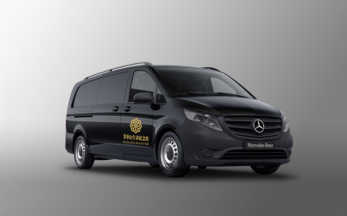
On the south bank of the Yangtze River is a mountain, which is surrounded by 36 mountain peaks, shaped like lotus flowers. As the Chinese character “hua” also means “flower” in ancient Chinese. This mountain is later called Bao Hua Shan (literally Treasure Flower Mountain). As Bao Hua Shan also connotes Lotus Mountain, we thus use the lotus as a base in our design concept but arrange the lotus flower in a vector image and combine it with the imagery of knots to symbolize the emotional connection with the deceased loved one, as the lotus flower, figuratively, implies freedom and purity, as if bidding farewell to the deceased. For the overall color tone, we mainly use black and gold (earth yellow) colors, in a hope to give viewers a solemn and noble feeling, to show the professionalism and services of the brand, and to make customers feel at ease.