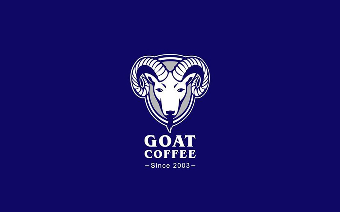
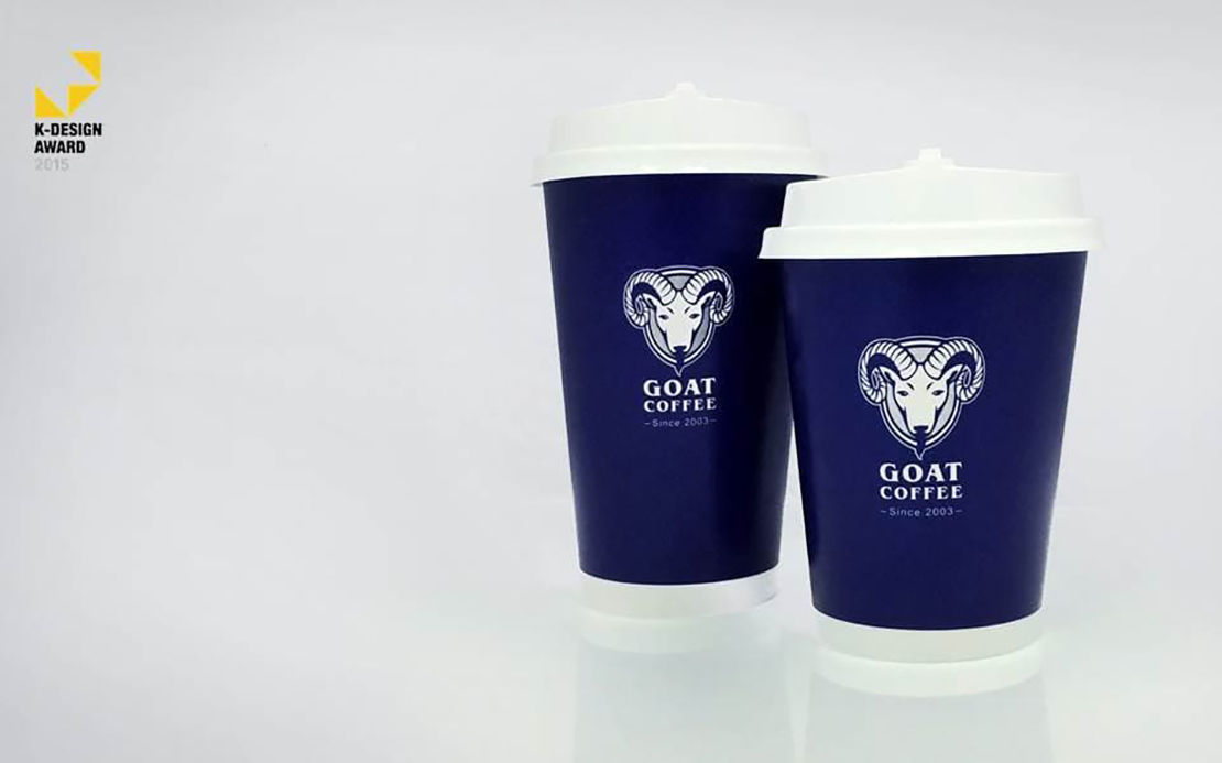
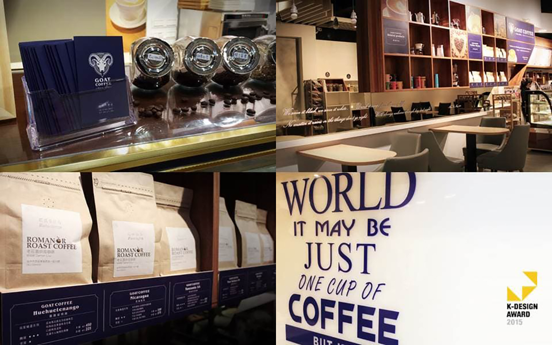
Sometime during the sixth century AD, goats discovered the coffee bean. If we look back to the origins of coffee, then we must use the best quality of coffee bean, and roasting skill, to represent our brand of "Goat Coffee." Moreover, we have decided to use the image of a goat as the basis of the brand's logo, to best represent the origin of coffee. The logo can be a symbol of the history and professionalism of our "Goat Coffee" brand. Regarding the color scheme, we have used blue, gray, and light colors, to give people an impression of stability and elegance, which also brings to mind European nobility. We believe "Goat Coffee" will stand out amongst other coffee brands!