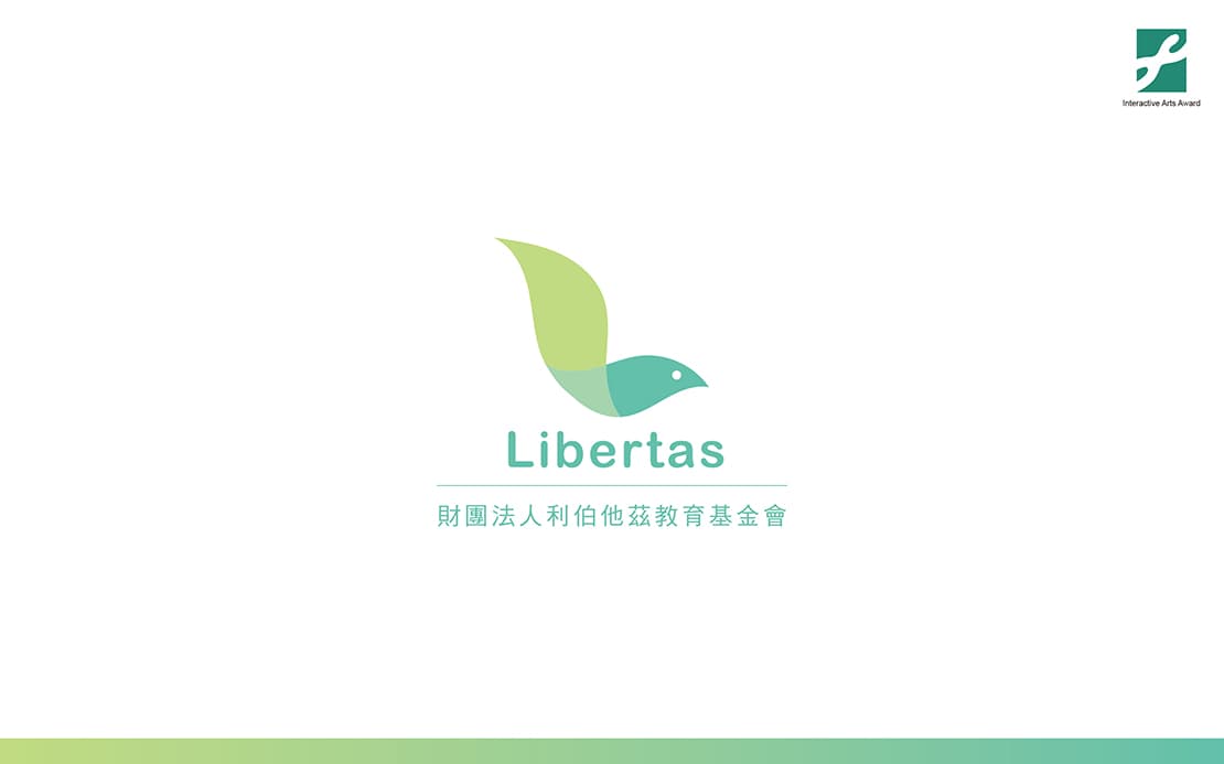
During the process of accompanying and getting on with rehabilitated drug addicts in this nearly 20 years, Libertas Foundation deeply understands that it is necessary to make the underprivileged minority of rehabilitated drug addicts back to the family and the society successfully as well as have a proper and suitable job for a stable income is the last and most important way. The brand name "Libertas" is derived from Latin and is translated as "free". To help the drug addicts out of the bundle of drug and access to physical and spiritual freedom is the main purpose.
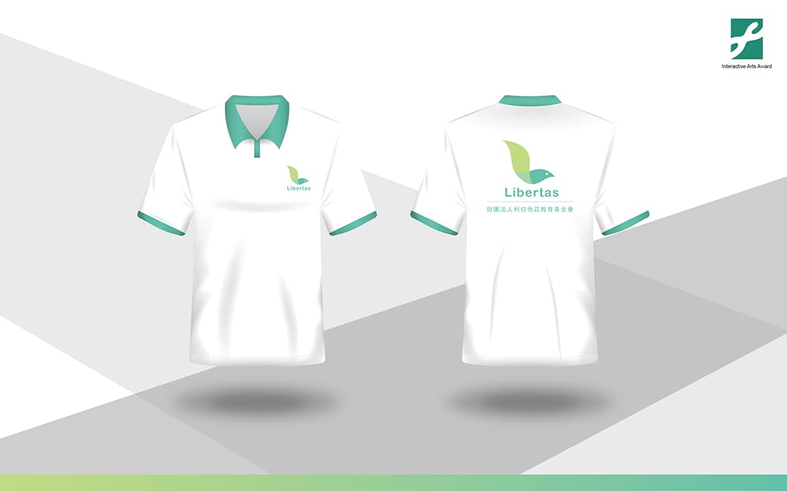
We use color blocks to overlap the brand letter L and transform it into a silhouette of a bird to convey the brand’s spirit - the concept of true freedom representing that every drug addicts can regain a fresh life and spread their wings to fly. The warm curve colors enhance the feeling of easy to approach and sense of trust. The purely unadorned logo symbolizes the pure heart, appealing the trust to the foundation and combining our original intention, which will take every drug addicts brave forward.
The overall hue of warm blue-green warms each of the partner and drug addicts’ heart. Neutral blue-green brings the image of profession and freedom, expecting every drug addict can obtain real freedom in the foundation.