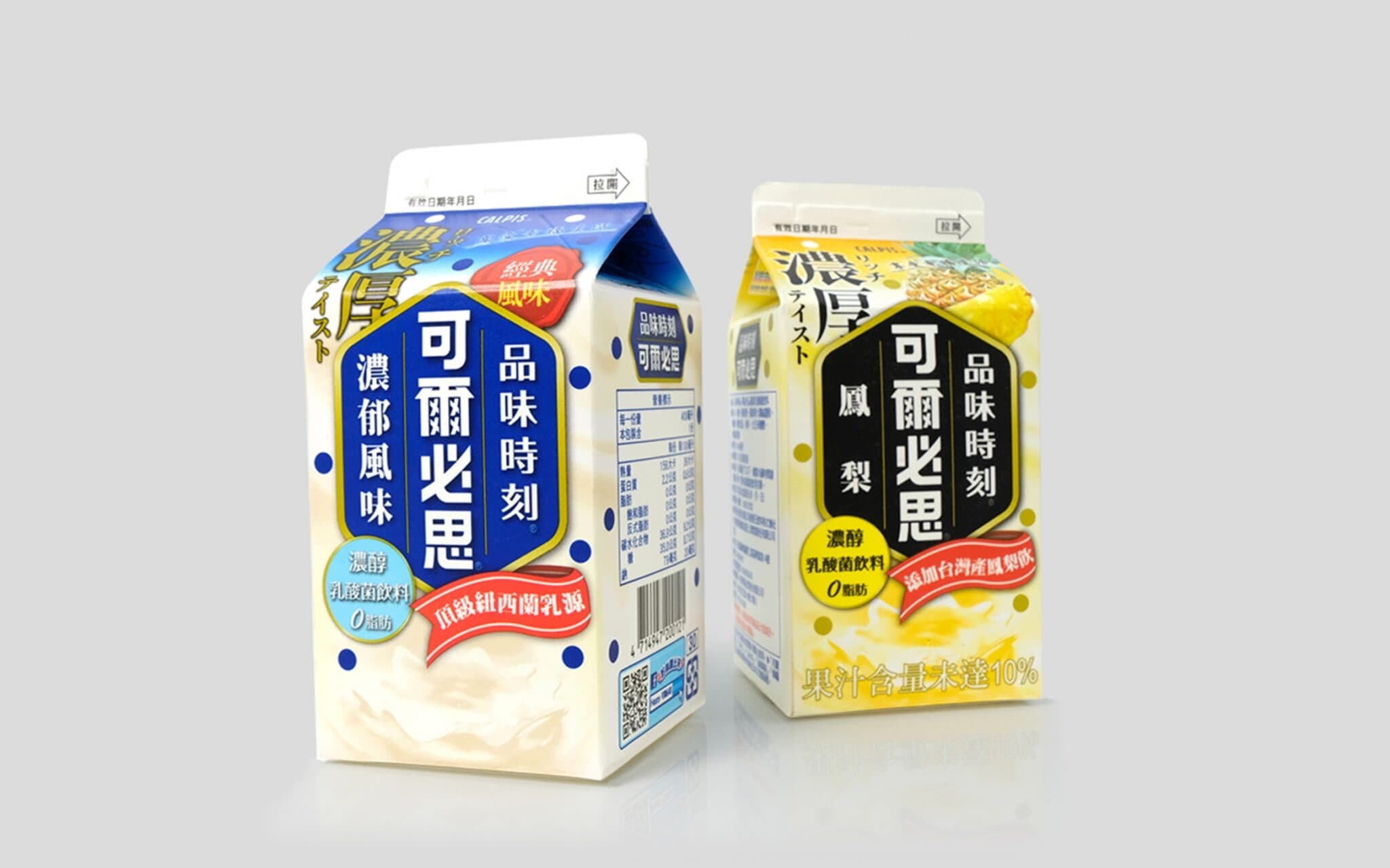
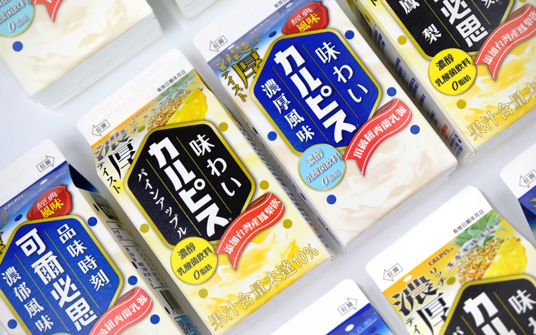
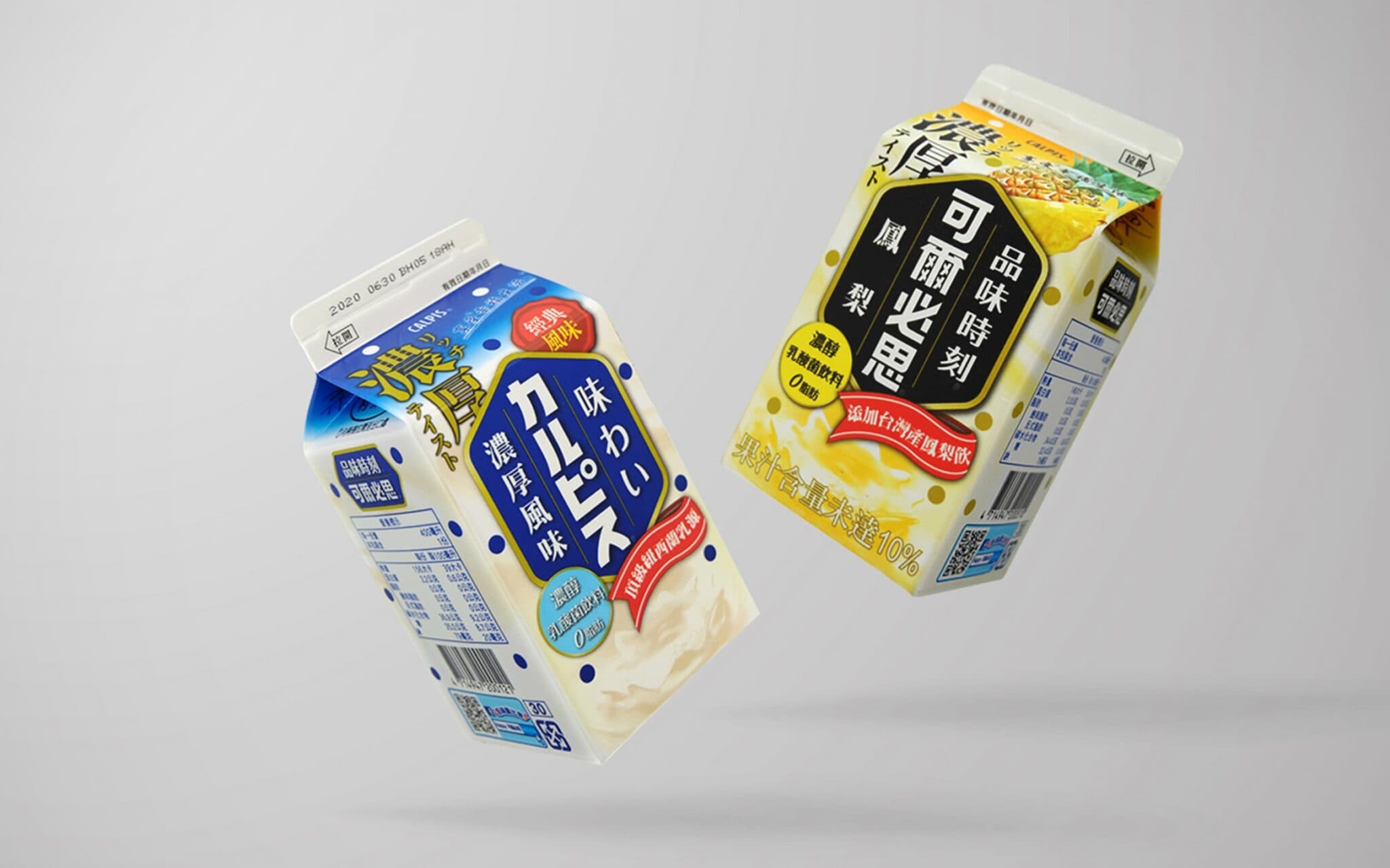
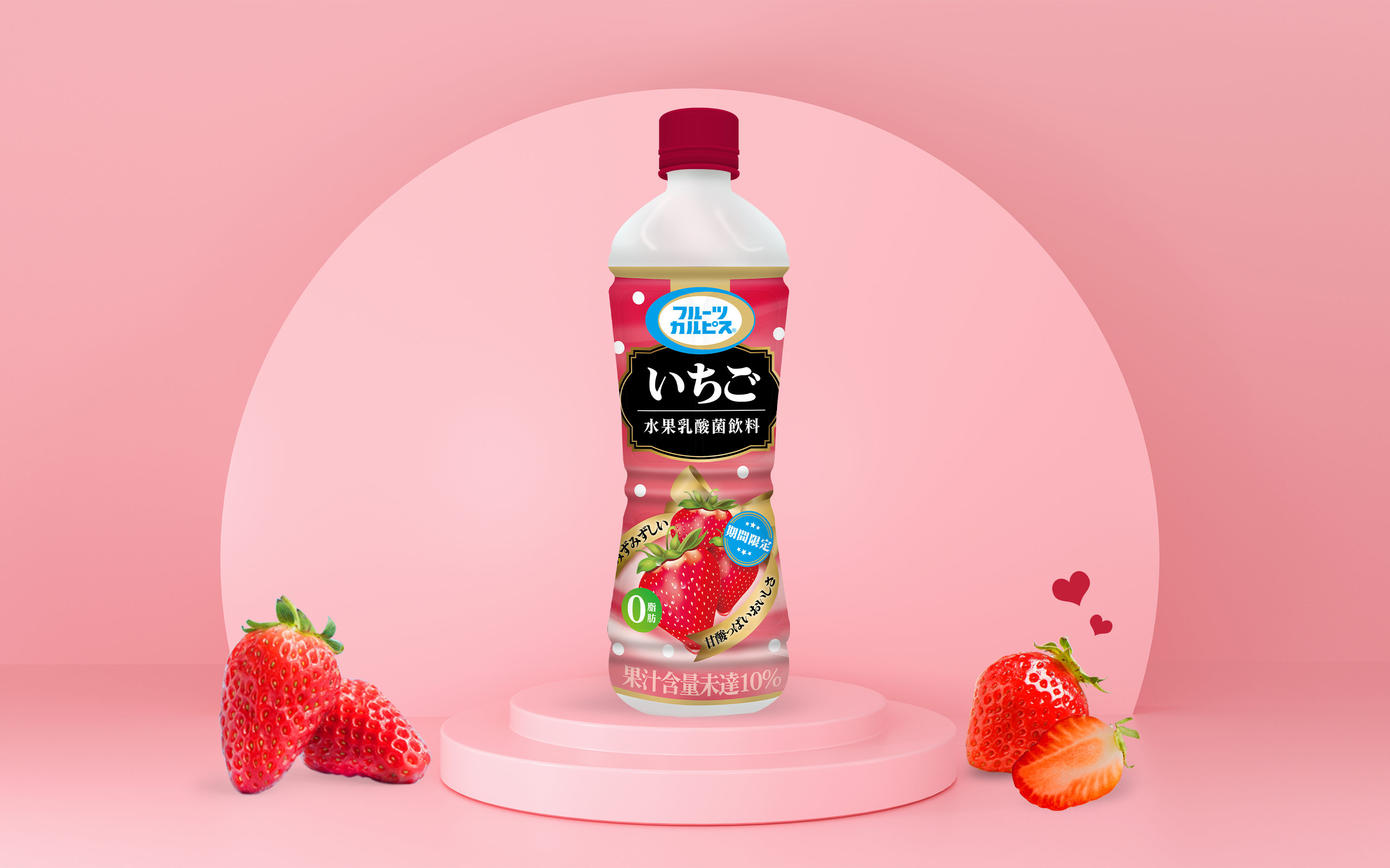
Japan's national lactic acid drink "Calpis" became a century-old brand in 2019. In 2020, the first product packaging appointed Smile Creativeness Design to revise the series of "Taste Moment" products. In addition to the rich classic flavor, seasonal flavor pineapple is launched for a limited time. Taiwan pineapple of the best season is selected, and the sweet and sour and fragrant Calpis are combined to become the first choice for hot summer beverages.
The visually eye-catching hexagon is the center of the main layout, and the crown of milk blossoms under the visual of the "thick" text presents a rich taste. The vermilion sealing wax in the upper right corner of the original packaging shows the hard work and persistence of the classic century-old brand; the pineapple flavor conveys a refreshing and light experience through watercolor illustrations. Men and women, young and old, holding this bottle of beverage can be full of artistic atmosphere.
In terms of the use of color, the original Calpis packaging is based on corporate blue, supplemented by texture gold, which not only enhances the level of the visual effect, but also brings customers a noble and extraordinary feeling, so that consumers can have the highest quality drinking experience. For pineapple flavor, sunny golden yellow with calm ink black brings out a steady, subtle and elegant atmosphere, showing a fresh and refined attitude towards life. The high-contrast color scheme allows the packaging to stand out among many competitive products, attracting customers' attention, and monopolizing the topic on the shelf has become the representative product of Calpis.