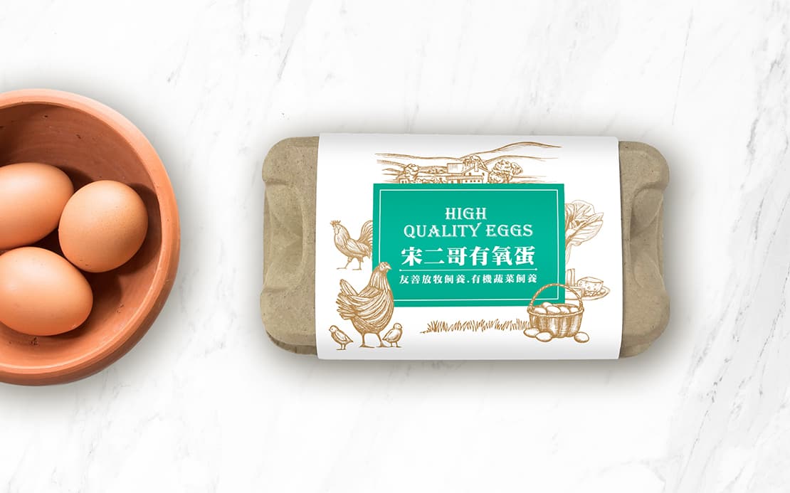
This design features the European hand-drawing style. A rural style is depicted with refined brushstrokes for the most natural and healthy visual presentation.
This design features the European hand-drawing style. A rural style is depicted with refined brushstrokes for the most natural and healthy visual presentation. The product name, both in Chinese and in English, will elevate the international image of the product while displaying our professional safety checks and our high quality friendly breeding practices. The choice of the elegant aquamarine color is aimed at high-end consumers who only buy the best eggs for their family members. Not only can we share our professional knowledge on selecting eggs, but we can also bring high-quality health to our loved ones.