"Viva! 萬歲牌!” ”Viva” in Italian language means hurray and also means a celebration for ten thousand years of age that including a meaning of the concept for health.
Viva brand nut products are carefully selected by Lian Hwa Foods procurement team by verifying the quality from the place of origin. Lian Hwa Foods has always adhered to the best quality for its products. As a result, its products have been loved by consumers for many years and have become well known as the best brand of nuts.
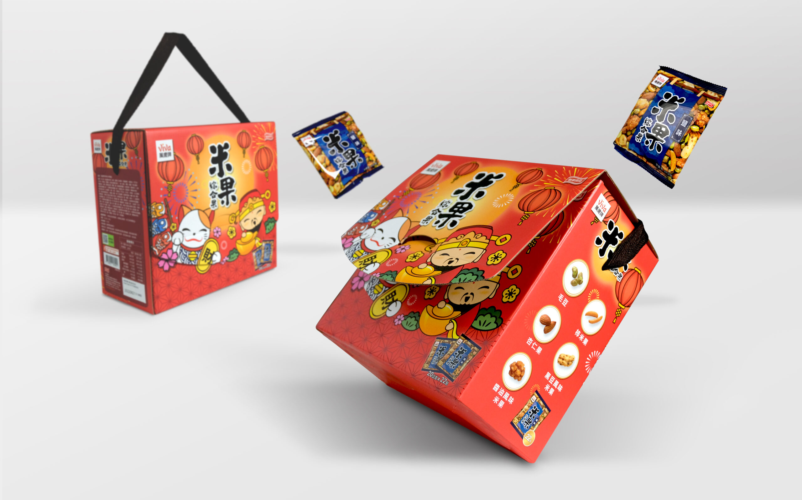
"Viva! 萬歲牌!” brand team has persistently devoted for the development of having variety of nut products. Now, we are launching the assorted rice cracker in salted and spicy flavor. This is an assorted snack containing high nutritious mixed nuts and crunchy rice cracker. It is a healthy snack suitable for both adults and children. It is an excellent snack for everyday friends and family gathering.
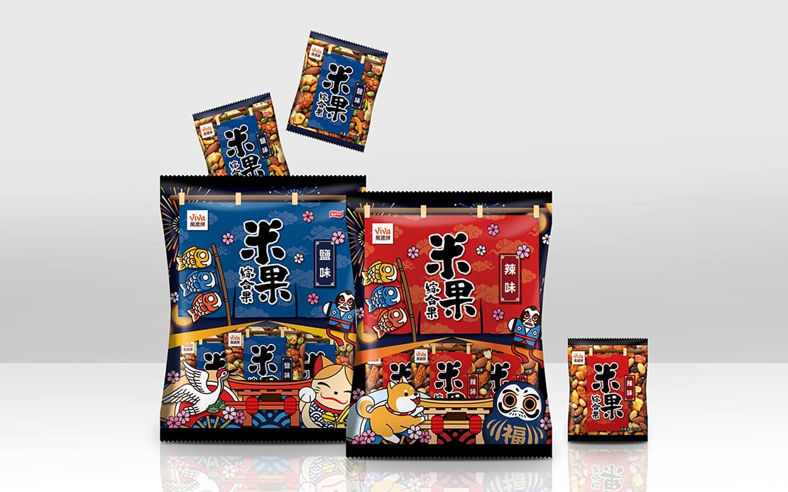
"Viva! 萬歲牌!” is your first choice for nuts. With its guaranteed selection process quality, you can enjoy the delightful healthy nuts all the time. The design of this package is based on the concept of a Japanese-style Izakaya (Japanese pub), with Japanese drapes as the main element, and with calligraphic writing for the title, so that the whole package is like a Japanese-style Izakaya (Japanese pub). This will make consumers feel as if they are on the streets in Japan and embracing Japanese local culture. Lovely Japanese summer festival illustration adds a spice to the packaging.